Monday, 18 February 2013

REI KAWAKUBO

OVERVIEW 

As the fantastically established Japanese designer behind the Comme des Garcons label, Rei Kawakubo has had a tremendous impact on the fashion industry. Her ability to utilise abstract shape and colour, in my opinion, has helped to shape a whole new outlook on our creativity in the way we dress ourselves. Japanese fashion has always been renowned for its sculptural, sometimes controversial approach to fashion and I think partly due to the popularity of Dover Street Market, Rei Kawakubo has done a great job of filtrating this attitude towards silhouette and overall boldness in personal aesthetic into the British fashion industry; and in return it has been received incredibly well. Unlike European and British fashion, Japanese fashion has the tendency to conveniently ignore the conventional focus on the silhouette of the female body and how clothing can flatter the form but instead focuses on how concepts and abstract shapes can be applied to the body in a three dimensional way. They choose to consider how conventional methods of dressing the body and constructing garments can be changed, manipulated and taken apart to create something dramatic and innovative rather than particularly aesthetically pleasing or functional; all of which I think Kawakubo is the most successful. Rei Kawakubo founded Comme des Garcons as a womenswear label in 1973 and later in 1978 added a menswear line. As quoted from http://www.designboom.com/portrait/comme_bio.html "for many, Kawakubo's arrival in the west, with the first Paris presentation of her collection in 1981, was something of a shock. She presented clothes the challenged accepted conventions. the collection was dubbed 'hiroshima chic' for its use of darkcolors, in particular black, which was not popular at the time."

FAVOURITE COLLECTIONS


Comme des Garcons Fall 2009 RTW


Comme des Garcons Spring 2012 RTW


Comme des Garcons Fall 2012 RTW


The Fall 2012 RTW collection is a stand out favourite collection for me purely due to it's simplicity and daring bold colour and shape of the exact aesthetic which designers avoid; the two dimensional. As quoted by Tim Blanks in his Style.com review in reaction to trend guru Li Edelkoort's negative comments towards online fashion show documentation, "all that detail going on in back, but who was aware of it, bar the few hundred people in the live audience? Maybe that's why so many designers have been talking about "tri-dimensionality" this season. And maybe that's why the ever you-go-north-I'll-go-south Rei Kawakubo chose this particular moment to present a show that glorified the flat. "The future's in two dimensions" was its provocative premise, and fans of Flat Stanley would have wallowed in the cutout paper-dolliness of looks like the red and pink felted coat-dresses that opened the show, or the lilac jacket and pants that followed. The only thing missing was the little paper tabs. But as the collection moved on, it felt less like Rei was being a contrary Mary than that she was actually making a comment on the state of the industry. 


COLLABORATION   

H&M

"The famously avant-garde Japanese label, spearheaded by design powerhouse Rei Kawakubo, will provide a range of both men's and womenswear, as well as childrenswear, accessories and a new unisex fragrance for the retailer. In honour of its Japanese roots, the collaborative line will launch exclusively at H&M in Tokyo in November before being rolled out worldwide a few days later." (http://www.vogue.co.uk/news/2008/04/03/comme-des-garcons-for-handm)


PRESS RELEASE:  comme_des_garcons_exclusive_collection_for_hm


HERMES

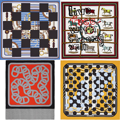
Although I'm not a huge fan of the application of pattern and surface design in my own work, I am really drawn to it in other peoples' collections and this is a perfect example of the kind of thing I like. The combination of traditional and abstract is a very recognisable aesthetic from Rei Kawakubo and by reworking six of the Hermes designs into limited edition pieces, they look set to be a great success. This 'vintage' silk scarf design has been very popular in recent years with young fashionstas utilising it as a way of giving their look a traditional edge.

"Kawakubo proved to be a 'very easy' and 'very nice' partner-in-crime. 'She knows what she wants,' Barret says, and was a seamless fit for Hermès, where collaboration is termed 'as opening the door, giving the keys and saying, let's have fun. ' An introductory meeting was followed by a second at the Hermès flagship shop in Paris, where Kawakubo was shown 250 scarves from the archives, 'so she could figure out what the treasure was,' Barret says. Kawakubo 'looked, watched and touched everything' and then asked 'a ton of technical questions'. 'She was very sharp and precise about printing,' Barret adds.
'And that was very exciting.' Afterwards, Kawakubo asked for coloured copies of all the designs, from the 1950s, the 1970s and the present day, which would allow her to 'think about it and to know what to do'. At that time, there had been no mention of how many pieces she planned to create. But a few months later Kawakubo's designs for the two collections, Noir et Blanc and Couleur, appeared." (http://fashion.telegraph.co.uk/article/TMG9809180/Stablemates-Rei-Kawakubo-collaborates-with-Hermes.html)


 MY OPINION

Rei Kawakubo is personally one of my favourite designers as I have a particular interest in Japanese fashion and in turn, Comme des Garcons. The label has such a striking and bold aesthetic which I find very inspirational to my own design work as I have a tedency and desire to design and create garments of a less realistic formation. Structural and almost sculptural design is of great interest to me rather than presenting the body adorned in conventional, traditionally constructed garments. I prefer creativity and clothing with a concept which doesn't necessarily abide by the fashion 'rules.'


Comme des Garçons | Fall Winter 2012/2013 Full Fashion Show | Exclusive


CHARLIE LE MINDU

OVERVIEW

So French hair stylist Charlie Le Mindu has officially turned his attention to clothing fashion. Renowned for some of Lady Gaga's striking and sculptural hair styles, he is now using his love for the art of hair to demonstrate a somewhat unconventional clothing line. Charlie Le Mindu began designing clothes in 2009 but is now due to show at Paris Haute Couture week with his Spring 2013 collection using human hair and Japanese leather as his predominant choice of materials and is quoted "The hair just looks like textured leather,...it’s very organic, but also kind of fetishistic.” 


"To describe Le Mindu's childhood as unusual would be an understatement. Born to a Spanish gypsy father and a French drag king mother (one of the first in the country), Le Mindu's youth was filled with reluctant rugby matches and trips to watch his mother work the stage at gay nightclubs. "My mother always reminds me that, from the age of six, I wanted to be a hairdresser," says Le Mindu, who got his start playing with Mummy's locks and shaving the hair off his Barbie dolls. "I wanted to make them look like lesbians," he quips in his frank, utterly French, and often unintentionally funny tone." (http://www.interviewmagazine.com/fashion/charlie-le-mindu/#_) And upon my learning of this, there appears to be instant clarity in terms of where his inspiration and drive formulates from, considering his four years cutting the hair of drag queens in Berlin from the age of 17, it is understandable that his development of style happened to be a little eccentric. Although despite this, from the very beginning of his career he has always preferred to work traditionally and insisted on traditional training methods when learning his trade in hair styling. Himself donning a retro punk revival 'do' inspired by that of Johnny Depp in Cry Baby, this traditional insistence is clear to see. He is quoted by Interview Magazine to have described "this day and age, maybe because of grunge and all that, people think it's sexy to look like a mess. And it is. But sometimes we need to look to the past. Not copy it, but just take it as an example."

As a hair stylist and designer combined, Charlie Le Mindu takes influence from 'older' icons such as Cher, Iggy Pop and John Waters as well as lesser known personalities who may be known for certain statements or obscurities. "Conversely, he is also inspired by a number of new and unique performers from the present, citing Canadian artist, musician and music video director Claire Boucher (a.k.a Grimes), British singer-songwriter and actress Rita Ora, American rapper and lyricist Azealia Banks (formerly known as Miss Bank$)."

COLLABORATION 

Charlie Le Mindu has really been able to flaunt his name since his collaboration with Lady Gaga. She has been spotted countless times wearing his boundary-pushing, exclusive creations; these designs even making it to her album covers.  She has stepped out wearing some incredible pieces by Le Mindu, particularly head pieces, and has been a great platform for his career in terms of gaining recognition and to some degree acceptance by the fashion industry. It would now probably come as no surprise to you that he was infact also the mystery artistic mind behind Gaga's world renowned 'hair bow.' 


MY OPINION

I personally am not a huge fan of Charlie Le Mindu's work. There are some pieces which are beautiful, undeniably creative and innovative but I think it is very difficult to make such an unusual choice of material; such being human hair, look professional and sophisticated. Although he is clearly incredibly talented and advanced in his craft, I prefer his work on wigs and head pieces rather than his body adorments and I see them as appearing slightly cheap and often out of taste.


Monday, 11 February 2013

EPITOME OF ME

As our main focus currently is based around distinguishing what our influences are and what makes us the designers we are, I was asked to describe myself across three mood boards by collecting selected images of things I particularly like or am drawn to in terms of colours, composition and artistic style across all disciplines such as fashion, architecture, photography and art as well as music tastes, iconic figures and even film preferences. All of these things are valuable sources of inspiration, and as an artistic individual, things we draw from constantly without even making a conscious effort to do so. These sources are all around us all of the time; we can draw inspiration from anything and so I thought this was a really good excercise to visually collate examples of a huge range of things we simply 'like' and to see it laid out all together; I think its a really effective way of identifying an aesthetic and becoming aware of common features to associate with what may well develop into a personal style for your work in years to come. Of course tastes change but I think it places me at a great advantage to be able to identify my style and preference so that I am able to constantly refer back to particular images as inspiration.  Personally, as is probably apparent by looking at my mood boards below, I favour a more minimalist look in terms of shape and composition but in contrast am also hugely drawn to bold prints, colours and shapes within my own dress style which often translates through to my design work  in various ways. I think on a whole, I am simply drawn to images, fashion and such like which has the ability to make an impact in some way; whether it be because it is intrusive with colour and/or shape or if it be the content itself such as the eery Tim Walker photographs shown in the first mood board below. I think my attraction to bold colours and prints in the clothing I wear myself has a great impact on my enjoyment of adopting a simple, minimalistic style when it comes to my work and vice versa.  In terms of my mood boards themselves, it just came naturally for me to fade out the images and increase their transparency as I felt it created a cleaner finish; as someone who is effectively a technophobe and am next to useless when it comes to photoshop, I found this was the nicest way to work around and avoid the layering of images looking ugly with bold corners intruding on each other and creating a rather cluttered collection of images rather than something which works together beautifully to portray a collective image as a whole. Between myself and my partner, we used the following collection of words to describe my mood boards:


  • colourful
  • transparent
  • constrasting
  • linear
  • angular
  • modern
  • minimalistic
  • structural
  • bold
  • arty
  • grunge
  • pattern
  • simple


Following on from my self analysis, I was then asked to move on to my partner's mood boards and analyse those in the same way. I began with the most obvious adjectives and then built on them, looking for less obvious but apparent qualities. My descriptive list is as follows:

(In order from top to bottom) 
  • skeletal
  • anatomy
  • silhouette
  • sculptural
  • daring
  • form
  • experimental
  • impacting
  • fashion
  • natural

  • characters
  • super heroes
  • sci-fi
  • make believe
  • fiction
  • comedy
  • playful
  • humorous
  • sarcastic
  • fastastical       
                                                        
  • graphic
  • geometric
  • colour blocking
  • scientific
  • physics
  • illusional
  • crystals
  • bold
  • neon
  • astronomy


I think it is clear to see from these three mood boards that Jess has a very eclectic taste, taking inspiration from a huge range of sources and genres of media. Firstly, by looking at the first mood board we are able to see that she is drawn to a very sculptural style when it comes to fashion design, with a great imaginative approach to altering and addressing the silhouette; this is also reiterated by the abstract and geometric images presented on the left. This mood board depicts a very bold aesthetic with a strong reference to science, particularly astrology suggesting that Jess takes great inspiration from bright colours and abstract shapes created in a natural way. I think with the inclusion of the 'novelty' mood board above, it suggests that Jess has a playful approach to her work and has a work ethic derived towards the idea of enjoyment and maybe even costume. Fictional characters have been inspiring designers for years; I think the idea of bringing the make believe into the real world has a great appeal particularly when it comes to fashion because, when done well, fictional characters can be translated with great effect into something of high desirability in the fashion industry due to the costume-like features without appearing to be a cheap, novelty attempt to take inspiration from such a sources.